
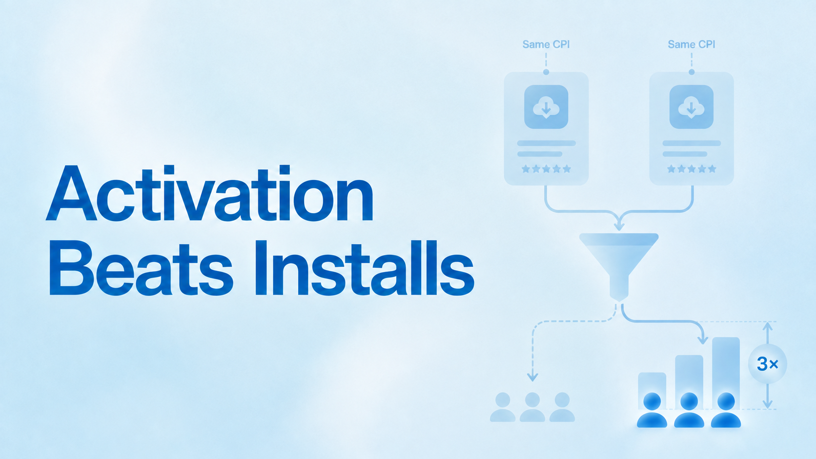
The install is the least useful number on your dashboard.
Two apps can report the same cost per install and be paying three times different amounts for a real user. Neither dashboard would show it. One team thinks acquisition is working; the other team thinks the same thing, and only one of them is right.
Here is the data, and what to do about it.
What is activation rate, and why does it matter more than install count?
Activation rate is the share of app installs that complete a defined in-app event representing genuine product value, such as a signup, first purchase or first meaningful session. It converts a cost per install into a cost per real user.
The distinction is that an install is a platform event and activation is a product event you define. The app store tells you about the first. Only you can define the second, which is exactly why it gets neglected: nobody hands it to you.
Every app draws the line differently. A fintech app might count a completed KYC. A marketplace might count a first search with results. A game might count tutorial completion. None of these are comparable across apps, and that is fine. The number is not for benchmarking against other people. It is for converting your acquisition spend into a figure that means something.
The gap between what you pay and what you think you pay
Across roughly 4.7 million installs at around 50 India-based apps running paid campaigns on Linkrunner between May and July 2026, median activation was around 67 per cent. The middle half of apps sat between roughly 52 and 81 per cent.
Now split those apps into quartiles by activation rate and look at what each quartile actually pays:
| Activation quartile | Activation | Blended CPI | Cost per activated user | Gap |
|---|---|---|---|---|
| Bottom quarter | around 35% | around Rs145 | around Rs420 | 2.9x |
| Middle half | around 74% | around Rs16 | around Rs21 | 1.3x |
| Top quarter | around 84% | around Rs27 | around Rs32 | 1.2x |
Cost per activated user is total ad spend divided by users who completed your activation event, rather than by users who merely installed.
Read the gap column. Weak activation means you pay close to three times your cost per install for each real user. Strong activation means you pay about one and a fifth. That multiplier is invisible on a dashboard reporting installs and CPI, which is what most dashboards report.
Ten of the 48 apps sat below 50 per cent activation, and between them they held around a fifth of all the ad spend in the sample. That is a meaningful amount of money flowing towards installs that never became users, in ordinary months with no seasonal pressure.
Methodology: Linkrunner projects with a connected ad network account and INR base currency, May to July 2026. Blended CPI is connected ad spend divided by total installs, which includes organic, so it understates paid-only CPI. Activation is each project's own defined event, so definitions vary by app. Use as bands, not targets.
Why optimising CPI makes this worse
This is the part that should change how you run campaigns.
Ad networks optimise towards the event you give them. Give them installs and they will find you installs, efficiently, by finding the people most likely to tap install and least likely to require any further commitment. Those are not the same people who become customers.
So the cheapest installs are frequently the least likely to activate. Which means a falling CPI and a falling activation rate are often the same event, described two different ways. Your dashboard shows the first as an improvement. Nobody is looking at the second.
Teams then double down. The campaign with the lowest CPI gets more budget, which is the campaign selecting hardest for people who will not activate. The efficiency gain is real and the outcome is worse. This is the same structural problem as paid installs cannibalising organic growth: the metric is accurate and the conclusion drawn from it is wrong.
Our guide to optimising CPI while maintaining quality covers the tactical levers. The strategic point is simpler: optimise CPI only once you can see what it costs you in activation.
Where activation actually breaks
Four causes, and they need different owners. Diagnose before you fix.
- Measurement. The event is not firing, or is firing inconsistently across platforms. This is more common than teams expect and it is the first thing to rule out, because every other diagnosis is wrong if the number itself is wrong.
- Routing. The user taps an ad for a specific thing and lands somewhere generic. They arrive holding an intent you created and no way to act on it. This shows up as an activation problem and gets misdiagnosed as a creative problem.
- Onboarding friction. Too many steps before the user sees value. Permissions, forms and account creation stacked in front of the thing they came for. Our post on onboarding metrics that predict retention covers where the drop-offs concentrate.
- Targeting. The traffic was never going to activate. Broad prospecting, incentivised placements or the wrong geography. This is the one where the fix is upstream in the campaign, not in the product.
The order matters. Verify the event fires, then check routing, then look at onboarding, then question the traffic. Teams usually start at the last one because it is the most comfortable, and spend weeks fixing targeting when the event was not firing on Android.
How to measure and improve yours
Define the activation event honestly. The first moment of real value, not the first tap. If you pick something too shallow, such as opening the app, your activation rate will look excellent and tell you nothing. If you pick something too deep, such as a third purchase, you cannot use it to optimise campaigns because the signal arrives too late. Somewhere in the first session or two is usually right.
Cut it by channel and campaign. The blended number hides everything that matters. Two campaigns at the same CPI with 80 per cent and 30 per cent activation are not the same campaign, and you cannot see that from an aggregate. This needs post-install event tracking joined to the campaign that drove the install.
Compare against your own history first. The distribution above gives you a rough sense of where you sit, but definitions vary so much between apps that your own trend line is more useful than any external band. If you are in the bottom quartile territory, below roughly half, that is worth investigating regardless of definition.
Then cut by cohort. Activation on its own is a snapshot. Activation by acquisition week tells you whether something changed, and when, which is what you need to act. Our guide to cohort analysis beyond D0, D7 and D30 covers building the cuts.
What to do with the number once you have it
Bid to activation, not installs. Most networks accept a post-install event as the optimisation target. This is the single highest-leverage change available, and it usually raises CPI while lowering cost per activated user. Expect to have that conversation with whoever watches CPI.
Report cost per activated user alongside CPI, never instead of it. You still need CPI to diagnose auction dynamics. You need cost per activated user to decide budgets. Reporting only one of them is how teams end up optimising the wrong direction for a quarter.
Expect it to fall under seasonal pressure. Broad targeting into a discount-driven moment produces the weakest cohort of the year. India's festive window is the clearest case: install volume rises, activation falls, and CPI looks flat or better while your real cost climbs. If you are planning festive spend, your pre-festive activation rate is the baseline that makes November interpretable.
Holding installs, activation events and spend together by campaign is what turns this from a quarterly spreadsheet exercise into a number you can act on weekly. If you want to see the split on your own data, request a demo and we will run the cuts with you.
Start with one number
Pull your last 90 days. Divide activation events by installs. Then divide ad spend by activation events.
If the second number is more than about 1.5 times your CPI, you have found something worth a week of attention. Most teams doing this for the first time are surprised, and the surprise is almost always in the same direction.
FAQ
What is a good app activation rate?
Across around 50 India apps we measured, the median was roughly 67 per cent with the middle half between 52 and 81 per cent. But definitions vary so much between apps that these are orientation bands rather than targets. Your own trend over time is the more useful comparison, and anything below roughly half is worth investigating whatever your definition.
What is the difference between activation and retention?
Activation is whether a new user reached first value at all, usually within the first session or two. Retention is whether they came back afterwards. Activation is a precondition for retention: a user who never activated has nothing to return to, which is why weak activation caps your retention curve no matter what you do downstream.
How do I choose which event counts as activation?
Pick the first moment a user experiences genuine product value. Too shallow, such as app open, and the number is flattering and useless. Too deep, such as a repeat purchase, and the signal arrives too late to optimise campaigns against. Somewhere in the first session or two is usually the right depth.
Can ad networks optimise towards activation instead of installs?
Yes. Most major networks accept a post-install event as an optimisation target, provided the event is passed back reliably and fires at sufficient volume for the algorithm to learn. This typically raises reported cost per install while lowering cost per activated user, which is the trade you want.
Why does a lower CPI sometimes make activation worse?
Because networks optimise towards whatever event you give them. Optimising for installs finds people most likely to tap install and least likely to commit further. The cheapest installs are frequently the least likely to activate, so CPI improvements and activation declines are often the same underlying change viewed from two angles.