You spent ₹15 lakh driving 50,000 installs last month. Your campaign dashboards look strong: CPI is down, install volume is up, and paid channels are performing. Then you check retention data and discover that only 8,000 users (16%) returned the day after installing. Three weeks later, fewer than 3,000 users are still active. You didn't have an acquisition problem. You had an activation problem that cost you ₹12 lakh in wasted spend on users who never found value.
This is the activation gap that separates growing apps from those that burn through marketing budgets without building sustainable user bases. Install count is a vanity metric. The metrics that actually predict long-term success measure what happens in those critical first minutes and hours after a user opens your app for the first time.
Onboarding quality determines retention more than any other factor. Apps with strong onboarding (users completing core actions within minutes, discovering key features, establishing habits) achieve 40-60% D1 retention and 20-30% D30 retention. Apps with broken onboarding (confusing flows, delayed value delivery, excessive friction) see 15-25% D1 retention and under 10% D30 retention. The difference compounds over time into millions in wasted acquisition spend or millions in captured user value.
Why Install Count Misleads: The Activation Gap
Most mobile marketing dashboards focus on install metrics: volume, cost per install, install attribution. These metrics matter for acquisition efficiency, but they tell you nothing about whether users who install actually become active, engaged, long-term users.
The activation gap is the difference between users who install and users who complete onboarding successfully enough to return. In most apps, this gap ranges from 30-60%. A majority of users who install never discover your core value proposition, never return after their first session, and churn before you can monetise or engage them.
This gap exists because acquisition and activation are disconnected. Marketing teams optimise for install volume without considering onboarding quality. Product teams build features without considering how new users discover value. The result is misaligned incentives where marketing celebrates hitting install targets while product teams wonder why retention is collapsing.
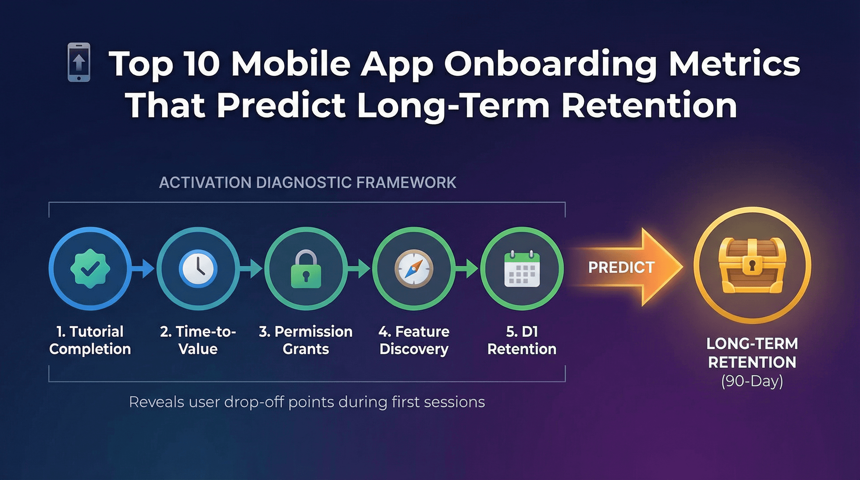
The metrics below measure onboarding quality from multiple angles: completion rates, time efficiency, permission granting, feature discovery, and early retention signals. Together, they form a diagnostic framework that exposes exactly where users are dropping off and which onboarding elements correlate strongest with long-term retention.
Metric #1: Tutorial Completion Rate (Target: Above 60%)
Tutorial completion rate measures what percentage of new users finish your onboarding tutorial or walkthrough sequence. If 100 users start your tutorial and 65 complete all steps, your completion rate is 65%.
This metric directly reveals whether your onboarding is too long, too complex, or poorly designed. Strong completion rates (above 60%) indicate users understand the value you're explaining and are willing to invest time learning your app. Weak completion rates (below 40%) mean users are abandoning before discovering core functionality.
Benchmark targets vary by complexity. Simple apps (games, content consumption, social) should achieve 70-80% completion because tutorials are short and straightforward. Complex apps (fintech, productivity, marketplaces) often see 50-65% completion due to inherent learning curves and verification requirements.
Low completion rates usually stem from three issues. First, tutorials are too long (more than 5 screens or 90 seconds). Users lose patience and skip to explore independently. Second, tutorials explain features before demonstrating value. Users don't care about feature lists until they understand why your app matters. Third, tutorials gate core functionality. If users can't access your app without completing tutorials, they'll abandon rather than invest time.
To improve tutorial completion, reduce length aggressively. Remove non-essential screens. Allow skipping without losing access to core features. Show value before explaining mechanics. For example, a photo editing app should let users edit a sample photo immediately, then explain advanced tools contextually as users explore.
Track tutorial completion as an onboarding event in your analytics platform. Segment by acquisition source to see if users from different channels have different completion rates. Users from brand search might complete at 75% while users from display ads complete at 40%, suggesting ad messaging misaligns with actual product experience.
Metric #2: Time to First Core Action (Target: Under 3 Minutes)
Time to first core action measures how quickly new users complete your app's primary value-delivering behaviour. For a food delivery app, this is viewing restaurant menus or placing an order. For a fitness app, completing a workout. For a messaging app, sending a message.
This metric correlates powerfully with retention. Users who complete core actions within 3 minutes have 2-3x higher D7 retention than users who take 10+ minutes. Speed matters because attention spans are short and competing apps are one tap away.
Benchmark targets depend on friction levels. Low-friction actions (viewing content, playing a level, browsing products) should happen within 60-90 seconds. Medium-friction actions (creating content, making a purchase, sending a message) typically take 2-4 minutes. High-friction actions (linking accounts, completing verification, uploading documents) might require 5-8 minutes but should still minimise delays.
Slow time to first action usually results from onboarding that prioritises setup over value. Apps that require account creation, profile completion, and permission granting before allowing any interaction create artificial delays. Users abandon because they haven't experienced value yet and don't understand why they should invest effort.
To reduce time to first action, defer non-essential setup steps. Let users experience core value immediately, then prompt for account creation and profile details later. For example, a recipe app should show personalised recipes immediately based on device location and time of day, then ask users to create accounts only when they want to save favourites.
Track this metric by measuring time between app launch and core action completion. Segment by user cohorts to identify patterns. If users who complete core action within 2 minutes have 65% D7 retention while users taking 6+ minutes have 25% D7 retention, you have clear evidence that speed matters for your specific app.
Metric #3: Permission Grant Rate (Push/Location/Camera as Needed)
Permission grant rate measures what percentage of users approve each permission request your app makes (push notifications, location access, camera, photo library, contacts).
Permissions enable key functionality and engagement mechanisms, but requesting them at the wrong time or without clear value communication kills conversion. Users who grant push notifications have 40-70% higher long-term retention because you can re-engage them when they become dormant. But requesting push permissions on app launch before users understand value leads to 60-80% rejection rates.
Benchmark targets vary by permission type and timing. Push notifications requested after users experience value typically achieve 40-60% grant rates. Location permissions for apps with clear location utility (food delivery, ride-hailing, dating) achieve 60-80% grant rates when requested contextually. Camera and photo permissions achieve 70-90% grant rates when requested inline during features that need them.
Low grant rates indicate poor timing or unclear value communication. Requesting all permissions upfront before users understand your app leads to reflexive denials. Requesting permissions without explaining why they're needed ("App Name would like to send you notifications") provides no motivation to approve.
To improve grant rates, request permissions contextually when they're needed for specific features. Before showing the system permission dialogue, display a pre-permission dialogue explaining the value: "Get notified when your food is 5 minutes away." This primes users to approve when the actual system dialogue appears.
Track permission grant rates by permission type and timing. Test requesting permissions at different points in onboarding to find optimal timing. For many apps, deferring push notification requests until after users complete their first valuable session doubles grant rates from 25% to 50%.
Metric #4: Account Creation Completion (Target: Above 40%)
Account creation completion measures what percentage of users who start creating accounts actually finish. If 100 users begin the signup flow and 45 complete it, your completion rate is 45%.
Accounts enable core functionality for most apps (saving data, syncing across devices, personalisation, re-engagement). But account creation introduces friction through form fields, verification steps, and password requirements. Balancing necessary account requirements with minimising abandonment is critical.
Benchmark targets depend on account necessity and friction. Apps where accounts are optional (games, content apps, utilities) might see 30-50% completion because casual users skip it. Apps where accounts are required (fintech, marketplace, subscription) typically achieve 60-80% completion because users who reach signup already understand value.
Low completion rates indicate excessive friction or poor value communication. Common issues include too many required fields (users abandon rather than complete 8+ fields), confusing verification (unclear instructions for SMS codes or email verification), and password requirements (complex password rules frustrate mobile users).
To improve account creation completion, reduce required fields to absolute minimum. Collect additional profile information later through progressive profiling. Offer social sign-in options (Google, Apple, Facebook) that reduce fields to one tap. Provide clear, simple verification instructions with inline error messages.
Track completion rates by signup method (email, phone, social) to identify which flows work best. Test reducing fields iteratively (can you eliminate the name field? the age field?) to find the minimum viable signup flow that still serves your business needs.
Metric #5: Profile Completion (Name, Photo, Preferences)
Profile completion measures what percentage of users who create accounts also complete profile details like names, photos, bio information, and preference settings.
Complete profiles correlate with higher retention because they indicate user investment and enable better personalisation. Users who upload profile photos in social apps have 50-80% higher retention than users with default avatars. Users who set preferences in content apps receive better recommendations, leading to higher engagement.
Benchmark targets vary by app type and profile importance. Social and networking apps where profiles are core to the experience should achieve 60-80% completion. Utility and productivity apps where profiles are secondary might see 30-50% completion.
Low completion rates usually mean profile setup feels optional or offers unclear value. If account creation succeeds without profile completion and the app works fine, most users skip it. If profile completion is buried in settings rather than part of onboarding flow, few users discover it.
To improve profile completion, integrate it directly into onboarding flows immediately after account creation. Explain specific benefits: "Add a photo so friends can find you" or "Tell us your favourite genres so we can recommend shows you'll love." Make profile setup feel progressive (3 quick steps) rather than overwhelming (fill out this entire form).
Track profile completion rates and correlate with downstream retention and engagement metrics. Prove that users with complete profiles have meaningfully better retention, then use that insight to justify prioritising profile completion during onboarding optimisation.
Metric #6: First Value Moment Reached (Product-Specific)
First value moment is the specific action or outcome that delivers genuine user benefit and creates understanding of why your app matters. For Spotify, it's hearing a song you love. For Airbnb, it's finding a place that fits your needs. For Instagram, it's seeing content from people you follow.
This metric measures what percentage of users reach this moment during first session. It's the most important activation metric because it directly predicts retention. Users who experience value return. Users who don't, churn.
Defining your first value moment requires understanding your core value proposition and identifying the minimum viable experience that demonstrates it. For most apps, first value moment happens when users consume content they care about, complete a task they needed done, or interact with people they want to connect with.
Benchmark targets depend on how quickly you can deliver value. Content and entertainment apps should achieve 60-80% first value moment rates because value delivery is fast (showing relevant videos, songs, articles). Transaction and service apps might see 30-50% rates because value requires completing more complex workflows.
Low first value moment rates indicate onboarding is delaying or obscuring value. Common issues include requiring too much setup before value delivery, showing generic content instead of personalised recommendations, and hiding core functionality behind navigation that new users don't understand.
To improve first value moment rates, reduce everything between app launch and value delivery. Use smart defaults to show useful content immediately rather than empty states. Highlight core functionality prominently in UI. Guide new users toward high-value actions through contextual prompts and progressive disclosure.
Track first value moment rates and correlate with D1, D7, and D30 retention. Prove the relationship between early value and long-term retention to justify prioritising activation improvements over new feature development.
Metric #7: Session Length in First Visit (Target: Above 2 Minutes)
First session length measures how long users spend in your app during their initial visit. This metric indicates whether users find enough interesting content and functionality to explore beyond the most surface-level experience.
Session length correlates with retention because longer sessions indicate engagement. Users who spend 4+ minutes in their first session have meaningfully higher D7 retention than users who spend under 1 minute.
Benchmark targets vary by app category. Content apps (social, media, gaming) should achieve 3-5 minute average first sessions because content consumption takes time. Utility and transaction apps (productivity, fintech, ecommerce) might see 2-3 minute first sessions because tasks are focused.
Short first sessions (under 90 seconds) indicate users couldn't find value quickly enough, encountered friction that blocked progress, or completed their immediate need without discovering deeper functionality. Very long first sessions (over 10 minutes) might indicate confusion rather than engagement in some apps.
To improve first session length without adding friction, surface multiple entry points to valuable content and features. After users complete one action successfully, guide them to related actions. Use contextual suggestions to help users discover additional functionality that serves their goals.
Track first session length distributions (not just averages) to understand behaviour segments. You might discover a bimodal distribution where 40% of users spend under 90 seconds (likely churning) and 40% spend over 4 minutes (likely retaining), with few users in between. This insight helps you focus on converting the quick-exit segment.
Metric #8: Feature Discovery Rate (Activated 3+ Key Features)
Feature discovery rate measures what percentage of users interact with multiple key features during onboarding, typically defined as activating 3 or more features within first session or first 24 hours.
Apps with deep feature sets see higher retention when users discover breadth early. Users who only know one feature are more likely to churn when they stop needing that specific functionality. Users who discover multiple features understand the product's full scope and find more reasons to return.
Benchmark targets depend on app complexity and feature count. Simple apps with 5-8 core features should achieve 40-60% rates (users activating 3+ features). Complex apps with 15+ features might see 25-40% rates because discovering breadth takes more time.
Low discovery rates indicate features are hidden, not contextually surfaced, or not clearly explained. Users stick with the most obvious functionality and never learn about secondary features that could increase their engagement.
To improve feature discovery, use progressive disclosure that introduces features contextually as users progress. After users complete one action, show related features that extend that workflow. Use empty states to suggest features that fill missing functionality. Provide contextual tooltips that explain feature benefits when users encounter them.
Track which feature combinations correlate strongest with retention. You might discover that users who activate features A, C, and E have 70% D30 retention while users who activate A, B, and D have only 30% D30 retention. This insight helps you prioritise which features to surface during onboarding.
Metric #9: Social Connection Made (Referral, Follow, Share)
Social connection rate measures what percentage of users complete at least one social action during onboarding: following other users, inviting friends, sharing content, or connecting social accounts.
Social connections dramatically increase retention because they create network effects and interpersonal accountability. Users who follow friends or influencers return to see updates. Users who share content return to check engagement. Users who invite friends return because friends are using the app.
Benchmark targets vary by app category and social integration. Social networks and communication apps should achieve 50-70% connection rates during onboarding. Content and entertainment apps with social features might see 25-40% rates. Utility apps without strong social elements often see under 20% rates.
Low connection rates indicate social features are hidden, not valuable enough to motivate action, or requesting connections before users understand app value. Asking users to invite friends on first launch before they've experienced anything worth sharing leads to low conversion and potential backlash.
To improve social connection rates, integrate social actions into core workflows rather than treating them as separate features. When users complete valuable actions (creating content, achieving goals, making purchases), immediately offer sharing as a natural next step. Make social connections feel reciprocal ("Follow Jane and she'll follow you back") rather than one-sided.
Track social connection rates and correlate with retention and virality metrics. Prove that users who make social connections have higher retention and generate organic growth through network effects, then prioritise making social features more discoverable.
Metric #10: Return Within 24 Hours (D1 Retention Proxy)
D1 retention measures what percentage of users who install return to your app the day after first install. This is technically a retention metric, but it functions as an onboarding metric because it's the earliest signal of whether onboarding successfully created habits and motivation to return.
D1 retention is the strongest single predictor of long-term retention. Apps with 40%+ D1 retention typically achieve 25-30% D7 retention and 15-20% D30 retention. Apps with sub-25% D1 retention rarely build sustainable user bases because the cohort erosion is too severe.
Benchmark targets vary by category. Messaging and social apps should achieve 45-60% D1 retention because daily usage is inherent to value. Gaming apps typically see 35-50% D1 retention. Utility and transaction apps might see 25-40% D1 retention because usage is episodic.
Low D1 retention indicates onboarding failed to create enough value or habit formation in the first session. Users installed, explored briefly, then forgot the app existed or decided it wasn't worth keeping.
To improve D1 retention, ensure first sessions deliver clear value, create reasons to return (unfinished tasks, expected updates, scheduled content), and establish notification touchpoints that remind users without being spammy. Push notifications sent 12-18 hours after install with relevant content prompts can increase D1 retention by 15-30%.
Track D1 retention by acquisition source using your attribution platform. Users from organic search might have 50% D1 retention while users from display ads have 20% D1 retention, revealing channel quality differences. Platforms like Linkrunner automatically calculate D1 retention by channel, letting you identify which campaigns drive users who actually stick around.
Attribution Context: Tracking Onboarding Quality by UA Source
Onboarding metrics gain strategic value when segmented by acquisition channel. Different channels drive users with different intent levels, expectations, and quality profiles. Understanding these variations helps you allocate acquisition budgets intelligently.
For example, organic installs often show 50-80% higher onboarding completion rates than paid installs because organic users have higher intent and clearer expectations. Users from brand search complete tutorials at 70% while users from display ads complete at 35%. This doesn't mean display ads are bad, but it means you should expect different activation patterns and adjust your CAC tolerance accordingly.
Integrating attribution data with onboarding metrics requires connecting your MMP with your product analytics platform. Modern MMPs like Linkrunner provide native integrations with Mixpanel, Amplitude, and CleverTap, making attribution data available as user properties in your analytics tool. This lets you segment all onboarding analysis by campaign, channel, and creative without manual exports or custom integration work.
Track these channel-level onboarding metrics weekly:
Tutorial completion rate by channel
Time to first core action by campaign
Permission grant rates by creative
D1 retention by acquisition source
Use these insights to reallocate budget from channels that drive low-quality users who churn quickly toward channels that drive users who complete onboarding and retain.
Implementation Guide: Setting Up Activation Events
Implementing onboarding metrics requires defining events that track each metric and ensuring your analytics SDK captures them during user sessions.
Step 1: Define onboarding events in your event taxonomy: tutorial_started, tutorial_completed, core_action_completed, permission_granted, account_created, profile_completed, first_value_moment_reached, social_connection_made.
Step 2: Instrument these events in your app code at appropriate trigger points. Use your analytics SDK to send events with relevant properties (event name, timestamp, user ID, session ID).
Step 3: Create funnels in your analytics platform that visualise onboarding flows and identify drop-off points. A typical funnel: app_opened → tutorial_started → tutorial_completed → core_action_completed → d1_return.
Step 4: Build dashboards that track onboarding metrics over time and segment by acquisition source. Monitor week-over-week changes to detect onboarding improvements or regressions quickly.
Step 5: Set up automated alerts for significant onboarding metric drops. If tutorial completion falls from 65% to 50% week-over-week, investigate immediately for bugs or negative changes.
Request a demo from Linkrunner to see how attribution data integrates with onboarding metrics, giving you complete visibility into which campaigns drive users who successfully activate and retain long-term.
Optimisation Priorities: Which Metrics to Fix First
When multiple onboarding metrics are underperforming, prioritise fixes based on impact potential and implementation effort.
High Priority (Fix First):
Time to first core action (massive retention impact, usually fixable by deferring non-essential setup)
Tutorial completion rate (indicates fundamental onboarding problems, relatively easy to test alternatives)
D1 retention (strongest predictor of long-term retention, influenced by all other metrics)
Medium Priority (Fix Second):
Permission grant rates (enable key functionality and re-engagement, require careful timing and messaging)
First value moment rate (critical but sometimes requires product changes beyond onboarding)
Feature discovery rate (increases stickiness, requires contextual UI work)
Lower Priority (Fix After Others):
Profile completion (matters for some apps, less critical for others)
Social connection rate (only relevant for apps with strong social components)
First session length (more of a diagnostic metric than a direct driver)
Run A/B tests on high-priority metrics first. Even small improvements (tutorial completion from 55% to 65%) can dramatically increase effective CAC efficiency by ensuring more installed users become active, retained users.
Frequently Asked Questions
How do I know which onboarding metrics matter most for my specific app?
Calculate correlation coefficients between each onboarding metric and D30 retention. The metrics with strongest correlation are your highest-priority optimisation targets. This analysis typically reveals 2-3 metrics that matter significantly more than others for your specific app and user base.
Should I track onboarding metrics differently for iOS versus Android?
Yes. Permission paradigms differ (iOS requires explicit prompts, Android allows more background access), UI patterns vary, and user behaviour often differs by platform. Track and optimise onboarding separately for each platform.
What's a realistic timeline for improving onboarding metrics through testing?
Expect 4-8 weeks per major test cycle (hypothesis, design, implementation, data collection, analysis). Meaningful improvements require multiple iterations. Plan for 3-6 months of sustained focus to substantially improve activation rates.
How do attribution platforms help track onboarding metrics?
MMPs integrate with product analytics tools to add attribution context to all behavioural analysis. This lets you segment onboarding metrics by campaign, channel, and creative to understand which acquisition sources drive high-quality users who activate successfully.
Can I improve onboarding metrics without changing the product?
Messaging and UI changes can improve metrics like permission grant rates and tutorial completion without core product changes. But meaningfully improving metrics like time to first core action and first value moment usually requires product architecture changes that reduce friction and accelerate value delivery.